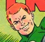
The Anatomy Lesson
No, not Rembrandt's. I am actually speaking of certain artists who desperately need to learn how to actually draw a human body...male OR female. So feast your eyes on THIS!

I slithered over to Comic Book Resouces Presents, and stumbled across their "Judging books by their covers" entry for the upcoming month of November, for Marvel. This, as you may be able to judge, is going to be the cover for something with Namor in it.
This is really really...terrible. It isn't very nice of me to say that of course. And for all I know, Michael Turner is a very nice man. But this is bad. Very bad. Rob Liefeld bad. Look...no feet!
It isn't right that Namor's arms are the same size as his thighs...not to mention his torso. Even taking stylelization into account, this is an odd rendering.
I rather like Namor. He's the only one of the Illuminati who isn't being portrayed as being a complete moron, and or Fascist. Sure, he's a little on the cranky side, but he has things on his mind. Besides, I'm a Guy Gardner fan. I LIKE assholes apparently.
You know who did a great job drawing Namor? Kevin Maguire in the Defenders mini-series. Not only was that a hoot and a half, but it had Namor with the most magnifient series of sneers that I have ever seen.
I guess I just don't understand the appeal of Mr. Turner's art. His women are all grotesquely waifish, with eyes the size of saucers and these strange elongated torsos. We've all seen the picture of poor Power Girl, so I won't inflict it upon you again. The men all have these bizarre cheekbones that can slice bread. The muscles have muscles.
Maybe I'm just being too picky, but although I like Namor, I'm not sure that I can bring myself to pick this up, although I must admit that my willpower always wilts when I'm standing in front of the shelves at my beloved comic book store. Because as much as I enjoy a well-written story, I do like to demand decent art to go with it.
Or it could be that I'm just feeling cranky today.


7 Comments:
The main problem I have with this rendering of Namor is that the character is overly beefed-up and muscled, while the character has always seemed to be more lean and slender to me.
-M
This is such a mess that it drove me from the sweet comfort of lurkerdom to comment. What's with the giant hand coming out of the crotch? That doesn't match up with the visible right elbow at all!
P.S. Great blog!
The great Burne Hogarth, one of the truly GREAT granddaddys of all comic book hero art, once said that by far the most difficult things to render in drawings are perspective and foreshortening. Perhaps Mr. Turner and a few other modern artists should review Hogarth's Dynamic Figure Drawing.
I think it was in one of those "Judging Books By Their Covers" posts, that someone noted Turner will go to serious lengths to avoid drawing feet. It seemed like an odd statement at the time, but looking over all the Turner covers Marvel had, I don't think you can see one foot in any of them.
Which I guess shows Turner is aware enough of one of his weak areas, to avoid getting it highlighted.
Does Turner some weird appeal that justifies Marvel using him on every stinkin' cover? Something I'm missing? Something that appeals to their perceived teen-age target audience for these books?
I mean, apart from the Boobies.
Turner art just annoys the piss out of me.
Yes, Sea, I adore Burne Hogarth. I have one of his Tarzan books, where he runs around nekkid for most of the time, and the contortions he put that boy through are truely awe-inspiring. BOY HOWDY, could he draw.
Thank you joshowa.
Matt, I agree, that Namor's body type should be a little more on the lean side. I also think that the Flashes shouldn't be so bulked up either. You don't need mind-boggling pectorals in order to run fast...or swim fast.
Calvin, Turner is as bad as Liefeld when it comes to drawing feet. Come on, they aren't THAT hard to draw!
Soup, I think you've hit the nail on the head. It's ALWAYS the breasts. Except that they aren't even well-drawn breasts. HUGE doesn't equate attractive. Of course I'm just a silly old girl, so what do I know?
Michael Turner just can't draw. I'm sorry about the guy's personal struggles, but that's the way it is.
And I love Namor too. He's been cranky from day 1!
Post a Comment
<< Home